Cortech Architecture
Logo, Identity & Package Design

- Categories: Identity
- Location: Virginia Beach, VA
- Client: Cortech Architecture
Published
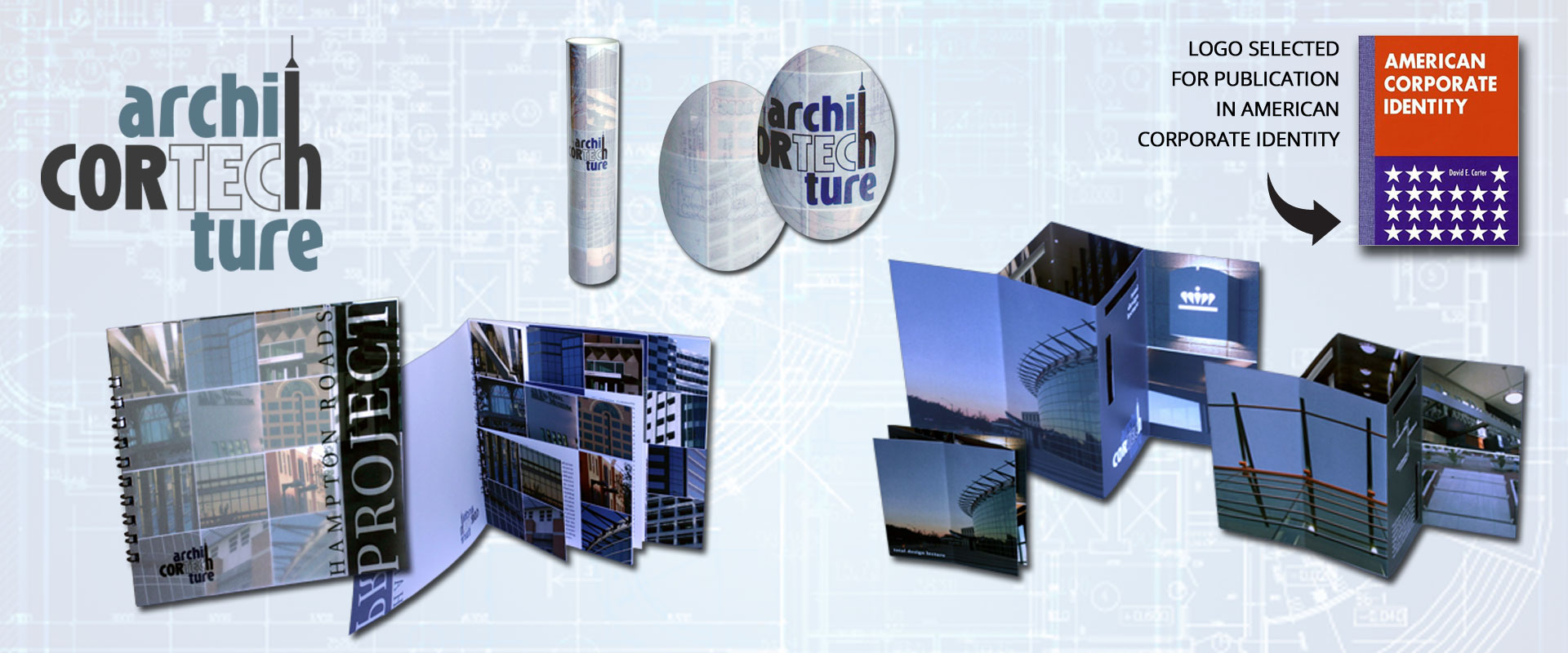
The judge panel at American Corporate Identity, an annually published book with juried entries of graphic and web design in several categories, chose this logo as a winner for the publication. Cortech was selected for its creativity and originality as a logo design. Twelve 24 Design is proud to have been selected for publication.
Representation
When a logo is being designed for a company, the client always dreams of how it will best embody the company and what it does. Twelve 24 Design came up with the idea to incorporate the name with the "what we do" in order to come up with a fitting design. Additionally, all of the print pieces were three-dimensional in one facet. The invitation both laid flat and folded out. The brochure, as you can see in the image, had pages that increased in size towards the back of the brochure, but that all overlapped to make the grid behind the vellum cover. The client loved how well it represented the company.


