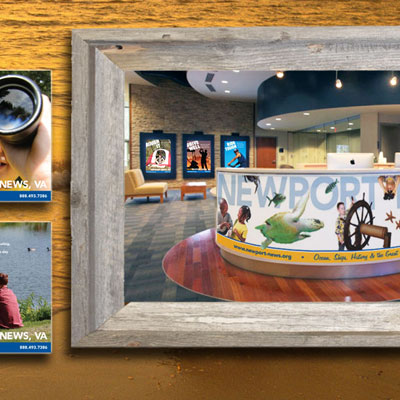
NNTDO
Identity & Web Design

- Categories: Identity • Web
- Location: Newport News, VA
- Client: NNTDO
Web Redesign
When the campaign redesign begun, the client had a website with much less information. After a lot of research and organization, we determined what information they wanted to be available on the site. The design and execution of this site layout is much more robust than previous versions, allowing a lot more information to be accessed while the user interface is a lot simpler to navigate.
Identity
When we began the identity redesign process, the director at NNTDO stated that her employees are all unique and she wanted the logo and the identity package to encapsulate that. It was a simple statement that we strived to accomplish. In the final designs, each employee could choose the color of their business cards, letterhead, etc. from the different options that we had created for the company from the final four-color palette. The director loved the individuality among employees that end result created.


